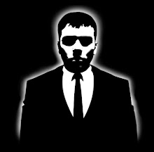
I've changed the direction I'm going with my identity and logo. I gave the cards a stark image of myself with my logo on my chest. I like the visual impact it has, but it also adds a goofy contrast to the type of guy I really am.

I simplified my logo a bit after getting some feedback. Someone commented that my previous version looked like a person on a skateboard. I immediately saw what they were talking about and I couldn't unsee it. So here it is in all it's glory.


Dude this is so much better. You look like a super hero... but what would LR stand for?
ReplyDeleteLightning Rod, no... how about Lame Retard! LMAO! I'm so funny.
Seriously, though I love it! It's so cool looking.